Published: October 28, 2013
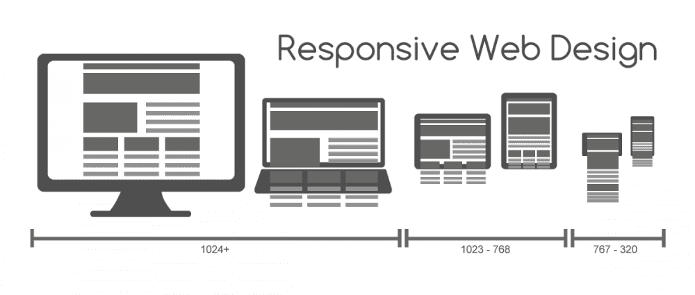
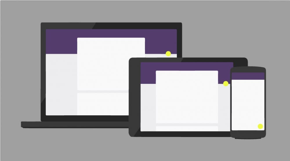
Entrenched in the world of technology, we are no stranger to perpetual change, particularly when it comes to adapting content and websites to a new and challenging set of device displays. For this reason, Envano has been an early proponent of future friendly philosophies and responsive web design implementation. The ease of site upkeep and value added to the user in terms of cohesive brand experience across devices, from desktop to mobile, offers a strong interactive strategy and makes for easy persuasion of most modern companies.
But for many, the responsive design sell is quickly complicated by internal systems and processes, particularly when it comes to content management. With almost a decade of experience creating responsive sites, Envano has dealt with our fair share of internal corporate systems while managing to produce visually appealing and high functioning responsive websites. And while we aren’t claiming to be perfect, we have learned a few things along the way when it comes to merging responsive implementation with internal interactive business solutions.
In May, we shared a few thoughts based on experiences with SharePoint and responsive web design working with the Ariens Company on AriensCo.com, Gravely.com, and ZeroTurn.com. Since then, we’ve also designed, built and launched a new responsive version of Ariens.com in tandem with SharePoint 2013. Needless to say, we are always learning and with each new site have a little more experience to build on and share.

The Strategy Behind SharePoint and Responsive Design
Before we jump into our top 5 tips for developing a responsive website in SharePoint, let’s talk quickly about the interactive strategy behind merging the two. As customers become increasingly mobile and maintain a high degree of interconnectivity with companies and each other, a mobile strategy for CMS or corporate content management systems is quickly moving from recommended to required. And while it’s always easier to design and build a responsive site free from external or integration constraints, the likelihood of that today, particularly in corporate situations, is slim to none. Luckily for our clients, Envano thrives on devising solutions for things that come off as slightly more challenging.
When it comes to our experience with SharePoint, we’ve been fortunate to have the opportunity to experience and experiment, working closely with our team at the Ariens Company. To us, SharePoint still seems a bit overkill for what it offers in terms of features and functionality. When you couple that with a unique implementation strategy like responsive web design, we’ve seen many developers come out with sites that lack in performance. The following tips will help avoid some of these common pitfalls.
Tips for Mastering Implementation
Since the latest go-around, we’ve summed our list of “learnings” up in five quick tips that might help make the difference in your responsive design SharePoint build.
- Access to the SharePoint “dev” environment from the start is necessary. Find a collaborative client or partner that provides access to this level of sharing throughout the development process.
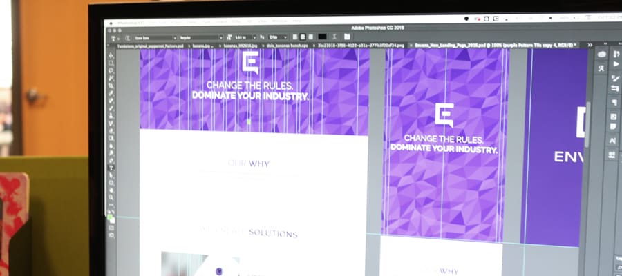
- Use Image Renditions, one of the best new capabilities of SharePoint 2013. This feature allowed us to take a single image and resize and crop it for different breakpoints, minimizing performance issues experienced when dynamically rendering images. On Ariens.com, Image Renditions was used across devices on the header banners.
- Cache pages in SharePoint to navigate the issues of large file size and unacceptable page load time.
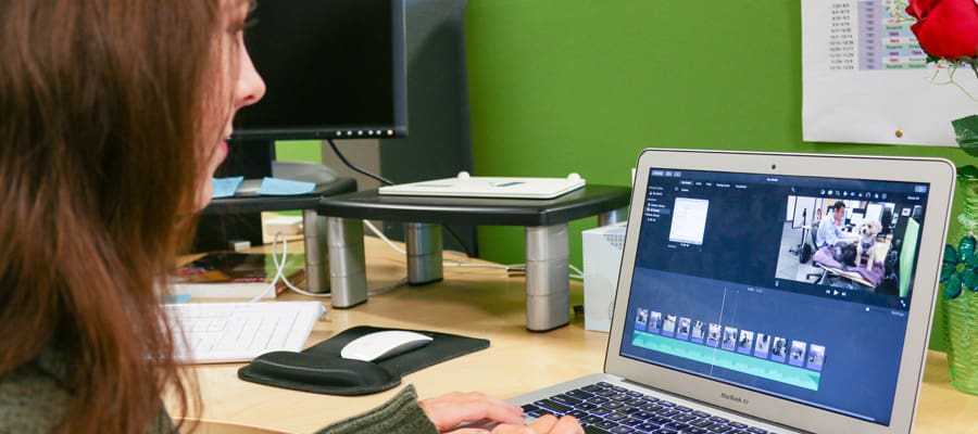
By Neal Grosskopf, Software Engineering Director
As our Software Engineering Director, Neal enjoys finding creative technical solutions for our clients. He also keeps the Envano team informed about new technology that helps us operate more efficiently and easily. When not at work, he’s most likely pursuing his other passion, photography, which often means lugging around camera gear cliffside at 2 a.m. to get that perfect shot of the night sky.
Responsive design is soooo important for SEO.
1. It gets rid of the problem with duplicate content.
2. It delivers a better user experience by device.
3. Increases accessibility.
Now a days people use all sorts of mobile devices to access web sites. It’s not going to change so it’s time to hop on board.
[…] For more information take a look at our updated post on 3 Tips for Mastering Responsive Design in SharePoint. […]
When you serve different size images are you still able to set them to width:100% to accommodate screen sizes that fall between a given range?