Published: May 10, 2013
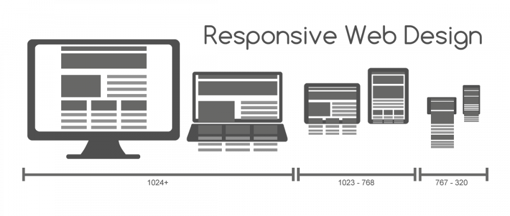
Future friendly. Mobile first. Responsive web design. All key to interactive business success in 2013. Yet, the challenges and opportunities related to applying these tools and strategies to sites that rely on a large corporate CMS often go undiscussed. With all the buzz about new philosophies and methods, we rarely hear about the bumps and bruises development teams experience along the way — from wireframes to a shiny new responsive web design (RWD) site.

SharePoint, for many developers, plays a role in some setbacks with responsive web design. We stumbled on the blog post, Responsive Web Design for SharePoint 2013 and SharePoint 2010 (by Eric Overfield) the other day and thought it appropriate to share some quotes along with a few things we’ve learned.
“I mentioned that Responsive Design and SharePoint (2010 and 2013) do not mix very well. There have been a few excellent examples of Responsive Design and SharePoint 2010 though including www.ITS.MS.gov, www.AriensCo.com, and www.GSE.IT/en/, but in general I see that Responsive Design principles will be difficult for many developers to implement in SharePoint.”
Shameless self-promotion? Maybe. But we are also very proud of our work with Ariens Company and are glad for the opportunity to share our thoughts. We are fortunate to have the opportunity to experience and experiment, designing and developing quite a few responsive sites in SharePoint with the Ariens Company. We’ve merged our responsive design expertise with Ariens’ SharePoint expertise to obtain great results in AriensCo.com, Gravely.com, ZeroTurn.com, and another new site launching soon!
Here are a few things we learned:
- SharePoint has a very large footprint in file size and page load time. This makes developing for mobile difficult, as the page load time is not the best. Together, Ariens and Envano worked to cache some of the pages in SharePoint to navigate this issue.
- SharePoint appears to truncate long lines of text within the CSS files and because of this, data URls don’t work.
- SharePoint 2013 uses an image resizing feature that is useful for serving up different sized images at different break points.
- SharePoint seems to include its own version of jQuery at random which can conflict with a site-wide version of it.
For more information take a look at our updated post on 3 Tips for Mastering Responsive Design in SharePoint.


Very nice article to start making SharePoint responsive.
I’m also working with responsive branding for SharePoint, let me introduce our work, take a look at http://bindtuning.com/
We have a tunning tool where you can fully customize a theme for SharePoint and besides being responsive the theme include a lot of features.