Published: August 4, 2014
You’ve surely heard it over and over. The best approach for development is to “start with mobile and design up.”

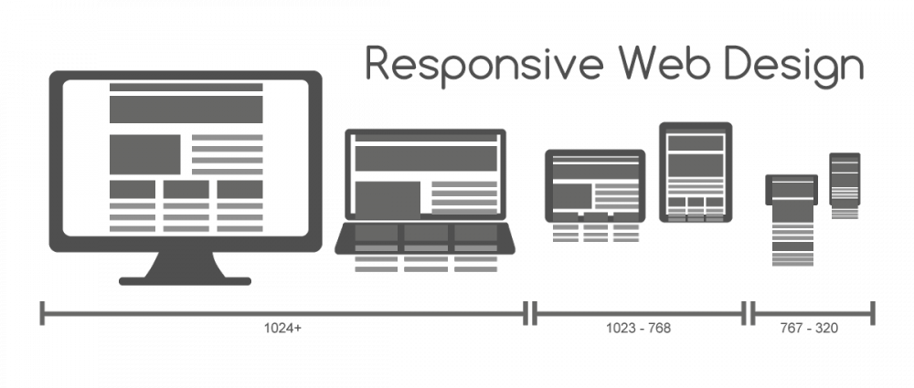
Because mobile is our smallest screen, the typical developer is instructed to begin with the core information and the best user experience for smaller screens before scaling to larger devices like tablets and desktops. With all of this talk around “mobile first” comes more buzz and jargon like liquid vs. adaptive vs. responsive design.
Unlike others out there, at Envano – we don’t take that approach. It’s not mobile first or desktop first.
What we do is not mobile first, but something more like ‘mobile in mind.’ “I don’t recall any responsive site that has been designed at Envano and started as a mobile design,” said Creative Director, Bill Zoelle. “Clients are typically more excited about the larger page layouts and want a mobile experience that ‘just isn’t horrible.’ The desktop version is what entices and excites a team about a project. Then, we design the desktop layout in a way that makes mental considerations for how content will be handled when the page gets narrower.”
Every design must work on the entire spectrum of sizes. Our approach is really a mix of all the most followed approaches out there today. To us, one specific approach doesn’t cut it. For example, responsive design is not good enough anymore.
With that said, taking into account the entire experience as a whole, Google’s Material Design philosophy is the new gold standard in our book.
What is Material Design?
When it comes to material design – it’s not just responsive layouts, or liquid layouts, or adaptive content. We take tricks from each of those areas to create the best experience at any single size. Operating under the material design philosophy, a user should never feel like the experience is different (on iOS vs. Android) even though on the back it’s like black and white.
Material design takes a step back from flat design trends – it is flat and minimal but by adding drop shadows and animation/motion to things, websites and designs start to feel material. Not in the way of trying to mimic paper or on the other hand, reality – but material design falls somewhere in the middle (think your iPhone home screen, where the icons shift when you move your phone around).
Material design is about creating a thoughtful design that’s still intuitive across any screen size or orientation (square, circle, triangle, organic). By this philosophy, thinkers have to consider animation, motion, and build important constraints. We have to treat things on screen like objects with predictable behaviors. Most importantly, we have to stop thinking of the web as a set of “pages” or “screens.”
Taking on a New Approach
Though Google’s material design site is new to many, the philosophy is something Envano is familiar with. Placing emphasis on important considerations like how photos and imagery work across platforms has challenged us to find solutions to responsive development while ensuring high-resolution viewing. In Google’s explanation of the approach, the team goes into greater detail of how to approach everything form typography to cards.
And while the technical element is not only important, but also interesting – what gets tricky is defining where mobile ends and tablet begins. Material design offers a solution for multiple sized devices. Yet, today we have desktops that are touch friendly and tablets that are the size of a desktop screen; bringing in additional non-traditional elements to a crowded mess of development considerations.
At the end of the day, it’s about creating an experience that caters to all different user experience functions while also accommodating for iOS and Android and Smart Watches and TVs and whatever enters the market tomorrow. It’s an exciting and challenging conundrum.
If nothing else about material design sparks your intrigue, what more can we say than “Google loves it.” There’s always value in taking heed to philosophies and techniques that Google is a strong proponent of – they still rule the digital world.
By Loy Vang, Senior Digital Designer