Published: July 22, 2014
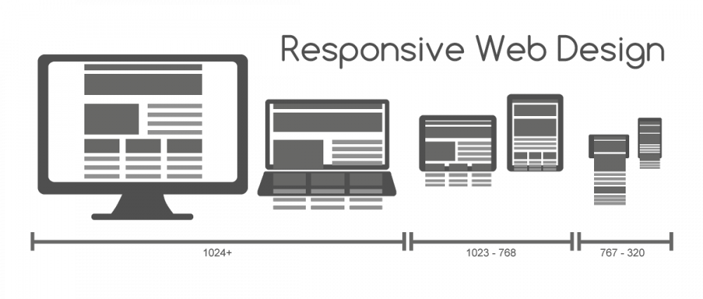
Responsive design is the extra step in paying attention to how the user is consuming information and giving them something that is more pleasant than a mobile experience on a desktop or a desktop experience on a phone. It tends to be one or the other for many companies, no one really does a good job at blending the two.
Though we are Apple enthusiasts through and through, the tech giant is a good example of what not to do. Take the page below for example, on exchange and repair extension programs. On a desktop this page is okay. But take a look at it on your mobile device and you’ll quickly notice it is hard to read, requires pinch and zoom, and doesn’t make it easy for many users who are likely accessing this phone related content on their mobile device. It highlights a great example of a large company that doesn’t understand what the user needs on the front-end and does not embrace responsive design.

Other common sites that tend to be neglected are government websites. In most government sites, you’re filling out a lot of information but nothing is easy or conversational. Take a look at IRS.gov versus Healthcare.gov.


On both a desktop and mobile device, IRS.gov pushes a lot of information, making it difficult for you to easily navigate and find what you need. Heathcare.gov, on the other hand, is built responsively, adjusts for users based on the device they use, and clearly displays and organizes content. Both sites with vast amounts of information and data, but only one considers user experience.
Another good example of a complex site that considers mobile users is Wisconsin’s Department of Transportation website. Although the site doesn’t have a responsive front end, they’ve attempted to appeal to people viewing on a mobile devices with a mobile version of the site.
Putting a responsive front end on a complex back end system is not a new strategy, but it does take some work. Echoed by Karen McGrane on A List Apart: “The tantalizing prospect of responsive web design is being able to solve the problem of “mobile” completely on the front end. The front end is so much more malleable than the back end, so of course we want to start there. But many responsive projects require changes to the way content and data are structured and published from the CMS or other legacy systems.”

By Bill Zoelle, Chief Creative Officer